An interactive introduction to QIIME 2
Contents
3. An interactive introduction to QIIME 2
In the previous chapter I introduced you to some concepts that will help you learn QIIME 2 more quickly. Now that we’re through that, let’s jump in and do something quick with QIIME 2. In this chapter I’ll present a workflow, which you should follow along with on your computer if possible. In this workflow we’ll download some real sequencing data and associated sample metadata, and apply some QIIME 2 methods and visualizers to it to see if it supports a hypothesis about the biological system being studied. The interactive visualizations that we’ll build in this chapter are some of the first ones that I generate when working with a new data set. They will help you to judge the quality of your sequencing run, and give you an initial view of the alpha diversity of your samples. Before you can apply these steps to your own data, you’ll also need to learn how to import your data into a QIIME 2 artifact. This will be covered in Importing data into QIIME 2.
3.1. The study
For the purpose of getting a very quick overview of QIIME 2, we’re going to work with a desert soil microbiome data set that I was involved with generating to study the Atacama Desert in northern Chile [NCC+17]. The Atacama Desert is one of the most arid locations on the Earth: in many years the hyper-arid core of the desert receives no rain at all. The data we’ll use here is sampled along a gradient from the hyper-arid core of the desert to the western foothills of the Andes mountain range, where there is more moisture resulting from snowmelt in the mountains.
I have a few hypotheses going into this analysis that we can test when we analyze the data. I’m formulating these hypotheses now, before I start analyzing the data, so I have an idea of what I expect to see. After analyzing the samples, I’ll have a good idea of whether the data supports my hypotheses or whether I’m surprised by the results. For the purpose of this introductory analysis I’m going to focus on one hypothesis.
Hypothesis: There will be fewer types of microbes in the hyper-arid samples than in the less arid samples.
Type of microbe is a term that needs to be defined. What I mean by that is an arbitrary taxonomic grouping, such as genus, species, or strain. The data we’ll work with in this chapter is 16S rRNA amplicon data. To keep the analysis in this chapter simple, we’re not going to assign taxonomy to our amplicon sequences. The unit of taxonomy that we’ll work with here is the highest resolution possible for a study based on amplicon data: the amplicon sequence variant, or ASV. Each unique 16S rRNA amplicon that we observe in this study will be treated as a different ASV, and thus a different “type of microbe”. Due to the limits of resolution in a 16S rRNA amplicon study, this approximates genus or species but does not consistently represent a single named taxonomic level.
3.2. Downloading the data
We’ll begin this interactive overview by downloading a few files to work on. Do this as follows:
curl -sL \
  "https://data.qiime2.org/2020.11/tutorials/atacama-soils/sample_metadata.tsv" > \
  "sample-metadata.tsv"

curl -sL \
  "https://docs.qiime2.org/2020.11/data/tutorials/atacama-soils/demux.qza" > \
  "demux.qza"
You’ll see some output on the screen, and you should ultimately see that these two files were downloaded successfully.
Warning
If it seems like the download failed, remove any files that were generated by these commands and try to download them again. If you’re still running into errors, you should feel free to post a question to the QIIME 2 Forum. In general, if you’re confused about something in the book, or something isn’t working for you, the QIIME 2 Forum is the best place to get help. Start by searching to see if anyone has asked a similar question that has been answered. If not, post your own question. It can be intimidating to post questions to online forums, but it can also be extremely helpful. Don’t worry - the QIIME 2 community is very friendly and many of the people posting questions there had little or no experience using command line software before trying QIIME 2. Even if your question feels hopelessly basic, you can rest assured that someone has had or will have almost the same question you’re asking.
The two curl commands that you just ran each downloaded a file that we’ll use to get started on this analysis. The first, sample-metadata.tsv, is a tab-separated text file (the .tsv file extension tells you this). In QIIME 2, the sample metadata file maps sample identifiers to information about those samples. You should be able to open and view that file in a program such as Google Sheets (any text editor, such as NotePad, NotePad++, TextEdit, or TextMate, will also work, but the layout that will provided by a spreadsheet viewer will help you interpret the file contents). In this data set you’ll see that sample metadata includes information such as the latitude and longitude where a sample was collected, whether that site was classified as hyper-arid, arid, or semi-arid. As you can imagine, that information is essential for letting us explore the hypotheses that I listed above. Sample metadata is absolutely essential to your analysis, a topic we’ll revisit many times throughout this book.
The second file that we downloaded above is a QIIME 2 artifact containing our demultiplexed sequence data. This is sequencing data that has undergone some processing since it came off an Illumina DNA sequencing instrument. Specifically, the sequences have already been mapped to the samples they were observed in: a process referred to as demultiplexing. You can start a QIIME 2 analysis with data that is demultiplexed, as illustrated here, or data that is multiplexed. We’ll discuss this more in Demultiplexing a sequencing run. In this chapter we’re starting with already demultiplexed data to keep this overview brief.
3.3. Viewing summaries of sequencing run quality and demultiplexing
As mentioned in the previous chapter, QIIME 2 artifacts such as the demux.qza file that you just downloaded are intermediary files in a QIIME 2 analysis. They’re not meant to be directly viewed by humans. Generally when there is something important to view from a QIIME 2 artifact, such as a summary of the data, there will be a QIIME 2 visualizer that you can apply to that artifact. Some QIIME 2 visualizers are specific to a QIIME 2 artifact type, while others are more general purpose. We’ll look at an example of each in this chapter.
The first QIIME 2 command that we’ll use in this chapter is a visualizer that that is specific to visualizing summaries of demultiplexed sequence data with quality scores. In addition to a summary of the demultiplexing run, it provides information on the quality of sequence data in the form of interactive visualizations. You can run this command as follows:
qiime demux summarize \
  --i-data demux.qza \
  --o-visualization demux.qzv
Saved Visualization to: demux.qzv
Since this is one of the first QIIME 2 commands that you’ve run (at least while reading this book) let’s take a look at it in some detail. As we look at this command, I’m going to assume that you either have some command line software experience.
There are four components to notice on the first line of this command, and as is typically the case when running command line software, the command’s components are separated by spaces. The first space-separated component is qiime. This tells your computer that the QIIME 2 program should be run. The second space-separated component is demux. This is the name of the q2-demux plugin, as far as QIIME 2 is concerned, so this tells QIIME 2 that you want to use the q2-demux plugin. The third space-separated component is summarize, which is an action in the q2-demux plugin. This action generates a visual summary of demultiplexed sequence data. As mentioned in the previous chapter, if you’d like to learn about this action, you could run the command qiime demux summarize --help, which will print help text to the screen. Finally, the \ at the end of the line is worth mentioning now. When you’re working on the command line, line breaks (i.e., the character that is received when you press the Return key on your keyboard) signifies that you have finished entering the command and that the command should now be executed (i.e., run). Since QIIME 2 commands can sometimes be long, it’s helpful when documenting them to split them over multiple lines so that they can be read without the reader having to scroll to the right. If the documentation is being presented in a non-interactive medium, such as a printed book, the formatting of the command could actually be misleading - for example, it could look like you should press the Return key after entering only part of the command. Splitting long commands across multiple lines also therefore helps to ensure accuracy of the documentation and it improves readability. The \ character here simply means that the terminal shouldn’t interpret the line break that follows it as the end of the command, but rather that the command will continue on the next line. The same command, without the line breaks, would look like the following:
qiime demux summarize --i-data demux.qza --o-visualization demux.qzv
Saved Visualization to: demux.qzv
That command will do the exact same thing as the one above. As our commands get longer later in this chapter and beyond, this would be inconvenient to read.
After we specify the program (qiime), the plugin (demux), and the action (summarize) that we want to run, we provide options to that action to tell it what file(s) we want it to operate on and what we want the output(s) to be called. These components of the command are specified on the remaining lines. Let’s look at those now.
This action takes one QIIME 2 artifact as input, the demultiplexed sequences that we downloaded above. In the QIIME 2 command line interface, input artifacts are always specified with options beginning with --i-. This command will generate one file as output, and we specify the path (absolute or relative) where we want to store that file with an output option. Output options always begin with --o- in the QIIME 2 command line interface. Here I specify that the output created by this command should be called demux.qzv. This is a QIIME 2 visualization that will contain the visual summary of our demultiplexed sequence data.
Finally, notice that this command printed some text to the screen when it was run: Saved Visualization to: demux.qzv. This indicates that the command ran and completed successfully. If the command did not complete successfully, you’d see an error message printed to the screen instead.
The next step is viewing this visualization. You can do this in a few ways, but the one I recommend right now is using QIIME 2 View. Open that page in your web browser now. You should see a big box on the screen where you can drop a QIIME 2 artifact or visualization to view it. Load the demux.qzv visualization by dragging and dropping it onto that box. A QIIME 2 visualization should load. (**TODO: The user may not know how to locate a file they have generated on the command line. Point to some guidance on this.)
Notice that this visualization has two tabs within the page respectively labeled Overview and Interactive Quality Plot. The Overview tab provides a summary of the sequence counts per sample (i.e., the number of sequences that were obtained for each sample in the sequencing run) (Fig. 3.1). Because this is a paired-end sequencing run this is presented for both the forward and reverse reads.
The median sequence per sample count is 7118. This is a bit lower than I typically like to see for a 16S Illumina run. I notice when looking at the details on the bottom of the page though that a lot of samples had very low sequence counts. Scroll down in the visualization on QIIME 2 View to see the number of sequences obtained for each sample. The very low sequences counts (less than a few thousand, though this is subjective) likely indicates an issue with DNA extraction or amplification of those samples.
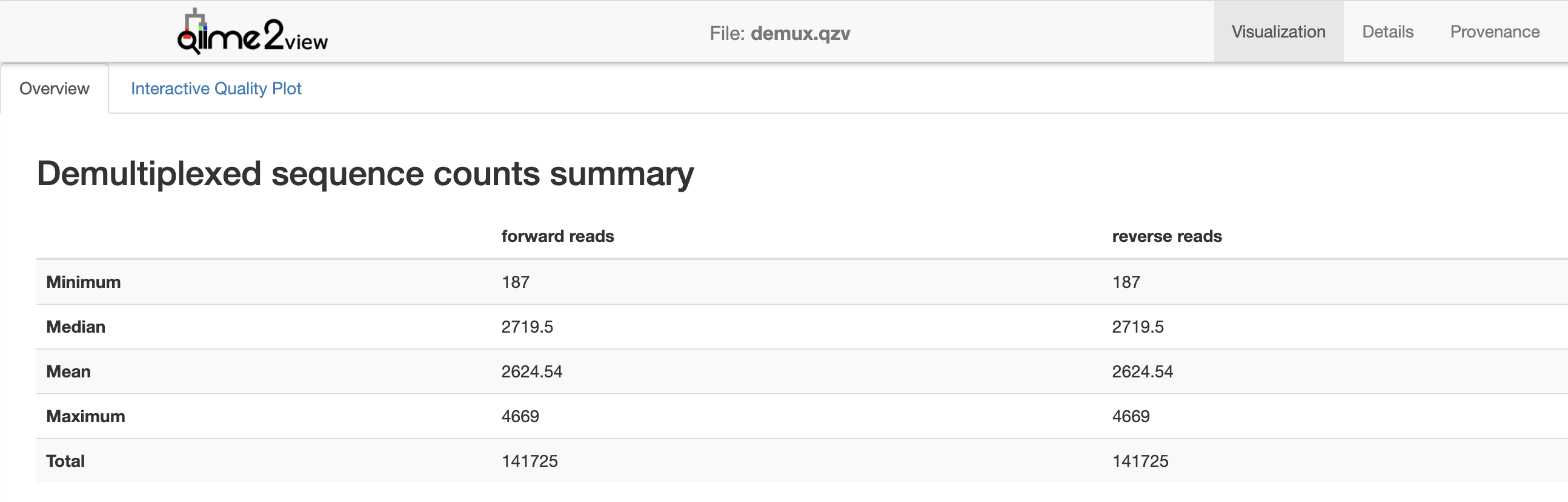
Fig. 3.1 Simplified screenshot of demux.qzv.
The second tab in this visualization, Interactive Quality Plot, presents a summary of sequence quality scores (y-axis) by sequence position (x-axis). Open that tab in QIIME 2 View. A box plot is presented at each sequence position, where each box presents five values from a seven-number summary. As you hover over the boxes in that plot, the full seven-number summary will populate the table below the plot. The forward read quality plot, and a seven-number summary of the read quality at a single position, are presented in Fig. 3.2. This looks like a high quality sequencing run to me.
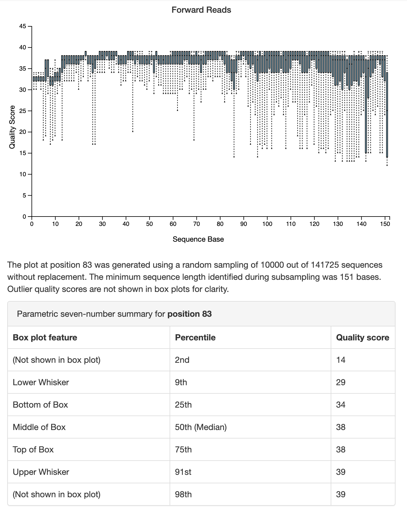
Fig. 3.2 Simplified screenshot of plot illustrating sequence quality by sequence position for forward sequencing reads. This plot and other information are presented in the Interactive Quality Plot tab of demux.qzv.
Spend a few minutes exploring this visualization, but don’t worry if you don’t fully understand it right now. We’re going to discuss these plots, as well as demultiplexing in general, in more detail in other chapters. Remember, the goal of this chapter is just to do a few things quickly with QIIME 2.
3.4. Denoising the demultiplexed sequences
Since our sequence quality generally looks good, let’s move on to the next step of our analysis: denoising the sequences (i.e., performing sequence quality control). QIIME 2 has a few options for denoising sequences. Here we’ll use the DADA2 denoising approach [CMR+16], which we’ll access through the q2-dada2 plugin. Go ahead and run this command, which may take up to about 10 minutes to complete.
qiime dada2 denoise-single \
  --i-demultiplexed-seqs demux.qza \
  --p-trim-left 13 \
  --p-trunc-len 150 \
  --o-representative-sequences asv-sequences.qza \
  --o-table asv-table.qza \
  --o-denoising-stats denoising-stats.qza
Saved FeatureTable[Frequency] to: asv-table.qza
Saved FeatureData[Sequence] to: asv-sequences.qza
Saved SampleData[DADA2Stats] to: denoising-stats.qza
As you can tell from the first line of this command, we’re calling the program qiime, the plugin dada2, and the action denoise-single. This runs DADA2’s single-end read denoiser, which may seem like a surprising choice given that I previously mentioned that this is paired end data. The reason that I choose to use the single end denoiser here is that these are short sequence reads for the region of the 16S rRNA that we’re sequencing. The region is about 350 bases long, but the sequencing run was a 2x151 run (where the 2 implies that it was paired end, for two reads, and 151 implies that 151 bases were read in each direction). These reads are too short for paired end joining for this region of the 16S, so I’m not going to join them here. (If we were to apply paired end joining with the denoise-paired action, the reads that failed to join would be excluded from the results. This would result in a bias for organisms with shorter 16S sequences, which would likely have a confusing impact on our findings.)
You can also see that this command takes a single file as input. This is the same file we provided as input to qiime demux summarize: our demultiplexed sequence data. This command generates three output artifacts, as specified by the --o- options. Recall that the unit of taxonomy that we’re working with in this chapter is the amplicon sequence variant (ASV). When DADA2 denoises a sequencing run, it defines the ASVs that were observed from the quality-controlled sequences. One of the outputs that it generates is the collection of the ASV sequences that were defined. This is one of the three outputs that are generated, and you can specify the filepath where you’d like to store that file with the output option --o-representative-sequences. I called that file asv-sequences.qza. DADA2 also creates our feature table, and the path where that should be stored is specified with the --o-table option. I chose the name asv-table.qza for this output file. The feature table is one of the most important piece of data that you’ll generate and use in QIIME 2. While the contents of the feature table can differ depending on the data that you’re working with or the stage of your analysis (something we’ll revisit later), the feature table we created here defines the frequency at which each ASVs is observed in each sample. The feature table contains samples on one axis and ASVs on the other axis, and the values in this table describe how many times each ASV was observed in each sample. The values can be zero or greater in this feature table. The third output generated by this command, specified with --o-denoising-stats, is a log of the denoising run that summarizes which quality control steps were taken.
There is also a new option type used here: --p-. This is a parameter option, which controls some aspect of how the action runs. In this case, we’re specifying two parameters options, --p-trim-left and --p-trunc-len. These are parameters used by DADA2 to assist in quality control. --p-trim-left specifies a position that all sequences should be “trimmed” at, meaning that all bases before this position (i.e., toward the 5’ end of the sequence from this position) are removed from all sequences. This is done because the initial reads of a sequence tend to be lower quality. You can see this in Fig. 3.2. The --p-trunc-len works similarly, but truncates the sequences at the specified position (i.e., all bases that are 3’ of the specified position are removed). In the Fig. 3.2 you can see that the median quality is lower than average before position 13 and after position 150 so I chose these values for trimming and truncating sequences in this data set. These are values that you’ll choose for each sequencing data set that you’re working with, and we’ll discuss choosing values for these parameters in Denoising demultiplexed sequencing data.
Your denoise-single command may have finished running by now. If not, take a break for a few minutes. Stretch your legs, go for a walk around the block, or grab a glass of water. Waiting for a long-running job (e.g., the command that is currently running) to finish is a great opportunity to break up your screen time.
Fig. 3.3 For programmers, waiting for code to compile is an excuse for a break. For data analysts, it’s waiting for a long-running job to finish.
3.5. Viewing a summary of the denoising run
The next visualizer that we’ll use is a general purpose visualizer that you should always keep in mind. It’s the tabulate visualizer in the q2-metadata plugin. This command uses the final option that the QIIME 2 command line interface uses: --m-, which specifies a metadata-related input. This might not seem very intuitive at the moment, but many QIIME 2 artifacts that provide some information on a per-sample basis can be used as if they are sample metadata. The power of this will become more clear in later chapters. We’ll apply this to the log artifact that was generated by denoise-single as follows:
qiime metadata tabulate \
  --m-input-file denoising-stats.qza \
  --o-visualization denoising-stats.qzv
Saved Visualization to: denoising-stats.qzv
Load the resulting .qzv file with QIIME 2 View. You should see something that looks like Fig. 3.4. This table presents the results of the denoising run on a per-sample basis. The input column of the table presents the number of sequence reads that were contained in the demux.qza for each sample. Other columns present information such as the percentage of input reads that passed the different quality filtering steps. We’ll revisit log file this in Denoising demultiplexed sequencing data.
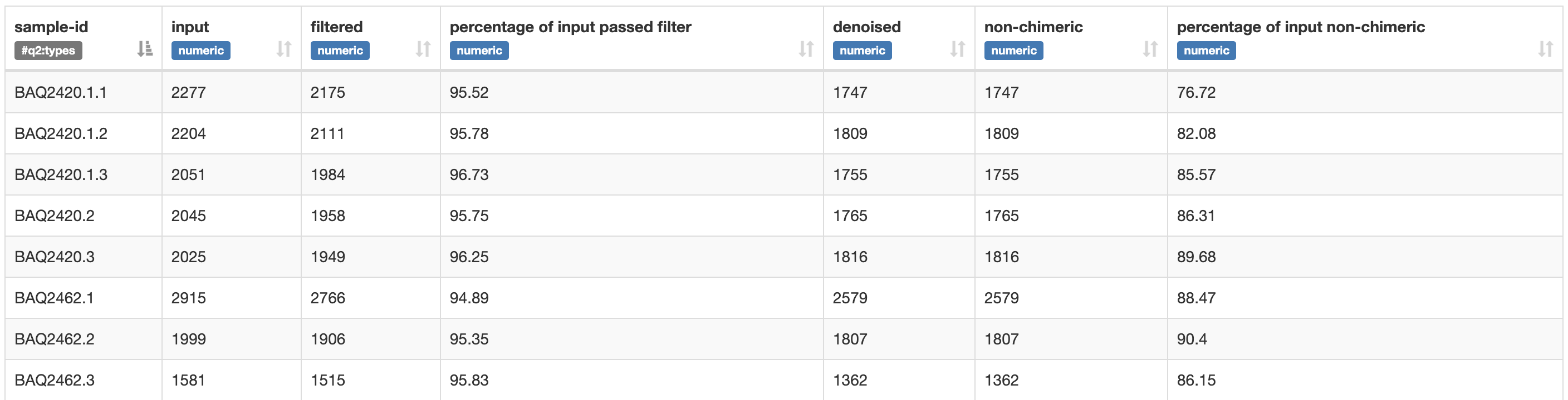
Fig. 3.4 Simplified screenshot of denoising-stats.qzv.
3.6. Viewing the ASV sequences
Recall that one of the outputs from DADA2 is the ASV sequences. We called this file asv-sequences.qza in this example. These sequences may be something that you want to look at, either now (maybe as a sanity check) or at a later stage of the analysis (for example, if you want to learn more about some ASVs that you have become interested in while analyzing your data). The q2-feature-table plugin defines a special purpose visualizer for generating a human-readable list of the ASVs. You can apply this as follows:
qiime feature-table tabulate-seqs \
  --i-data asv-sequences.qza \
  --o-visualization asv-sequences.qzv
Saved Visualization to: asv-sequences.qzv
Load the asv-sequences.qzv file with QIIME 2 View. This visualization initially presents a summary of sequence lengths (these are typically the same for single-end Illumina runs, so there is no variance in the sequence lengths with this data). Below this, there is a table presenting ASV identifiers, ASV sequence lengths, and the ASV sequences themselves. The ASV identifiers presented here are used internally by QIIME 2 and are not inherently meaningful. If you are ever presented with an ASV identifier and need to know what sequence it corresponds to, this table will provide you with that information. The sequences presented for each ASV are links that will let you quickly identify a sequence using NCBI BLAST. This is useful for rapidly getting information about a sequence, but using QIIME’s built-in taxonomic classifiers will yield more reliable and informative taxonomic information about sequences. We’ll revisit that in Taxonomic annotation and analysis of sequences.
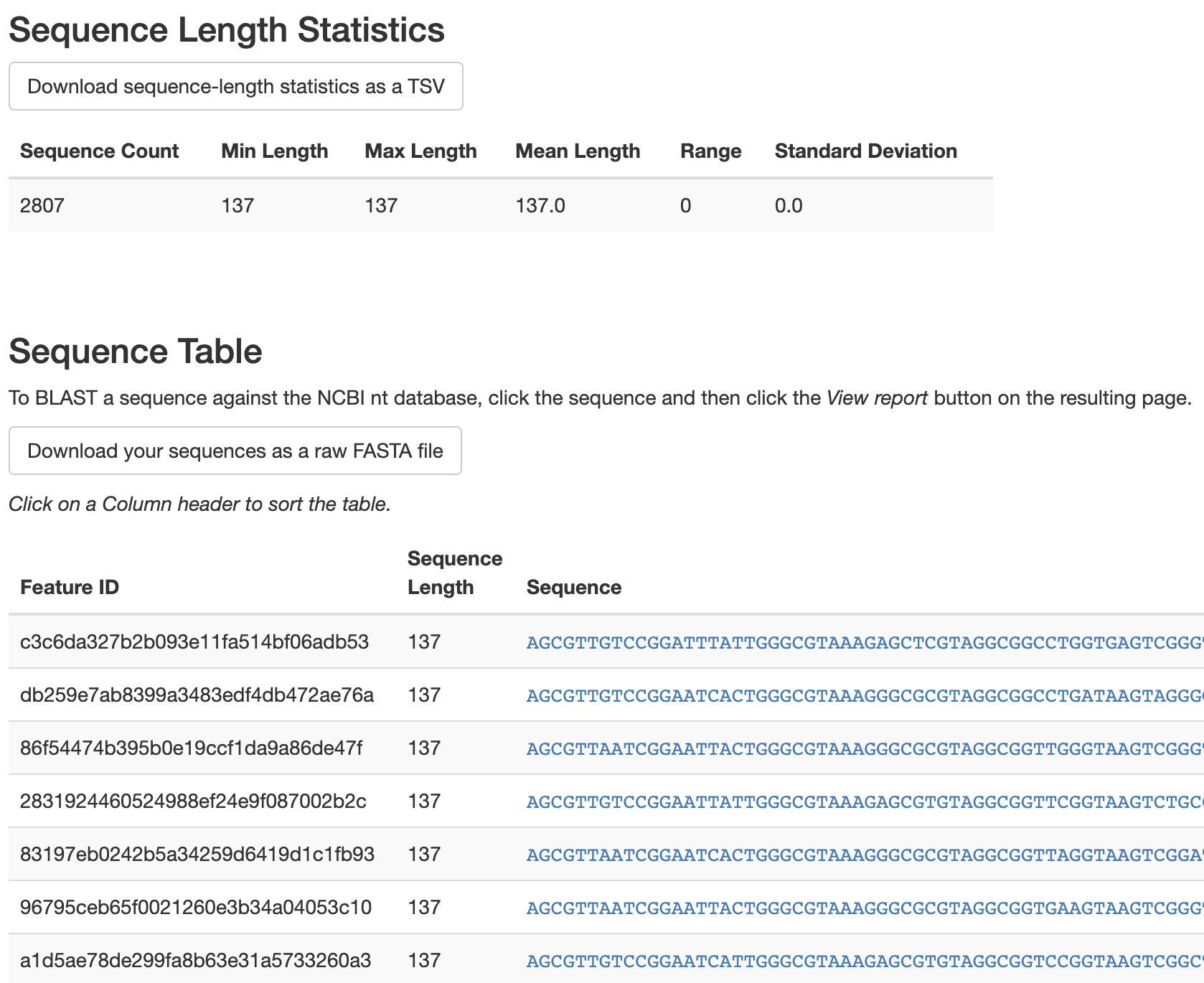
Fig. 3.5 Simplified screenshot of asv-sequences.qzv.
3.7. Viewing the ASV table summary
As mentioned above, the feature table defined by DADA2 contains samples on one axis and ASVs on the other axis. The values in this table describe how many times each ASV was observed in each sample. The q2-feature-table plugin defines another special purpose visualizer to allow you to get a summary of this information. This can be run as follows:
qiime feature-table summarize \
  --i-table asv-table.qza \
  --m-sample-metadata-file sample-metadata.tsv \
  --o-visualization asv-table.qzv
Saved Visualization to: asv-table.qzv
The first input that I provided is asv-table.qza, the feature table. The next input is our sample metadata, which we provided using a --m- option type. The final option tells QIIME 2 where to store the resulting visualization. Open that visualization with QIIME 2 View. You should see a view that looks like Fig. 3.6. Initially this tells you how many samples are represented in your feature table, how many features (which in this example are ASVs), and the total frequency (which in this example is the number of sequences observed across all samples, or the sum of all values in the feature table). Below this is a summary of the frequency (or number of sequences obtained) per sample in this table. This value is lower than the value we saw in the demultiplexed sequences summary (Fig. 3.1) - that’s because this is the median number of sequences per sample following quality control with DADA2, where the previous value presented the median before quality control with DADA2.
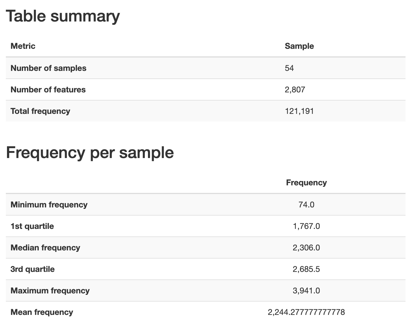
Fig. 3.6 Simplified screenshot of Overview tab of asv-table.qzv.
To explore the frequency per sample in more detail, switch to the Interactive Sample Detail tab in the visualization. This allows you to group samples by metadata and observe any differences that might arise across metadata categories. Under the Plot controls section of the visualization, select vegetation from the Metadata Category dropdown box. Then, move the Sampling Depth slider to somewhere around 100. Your visualization should look something like Fig. 3.7 after this.
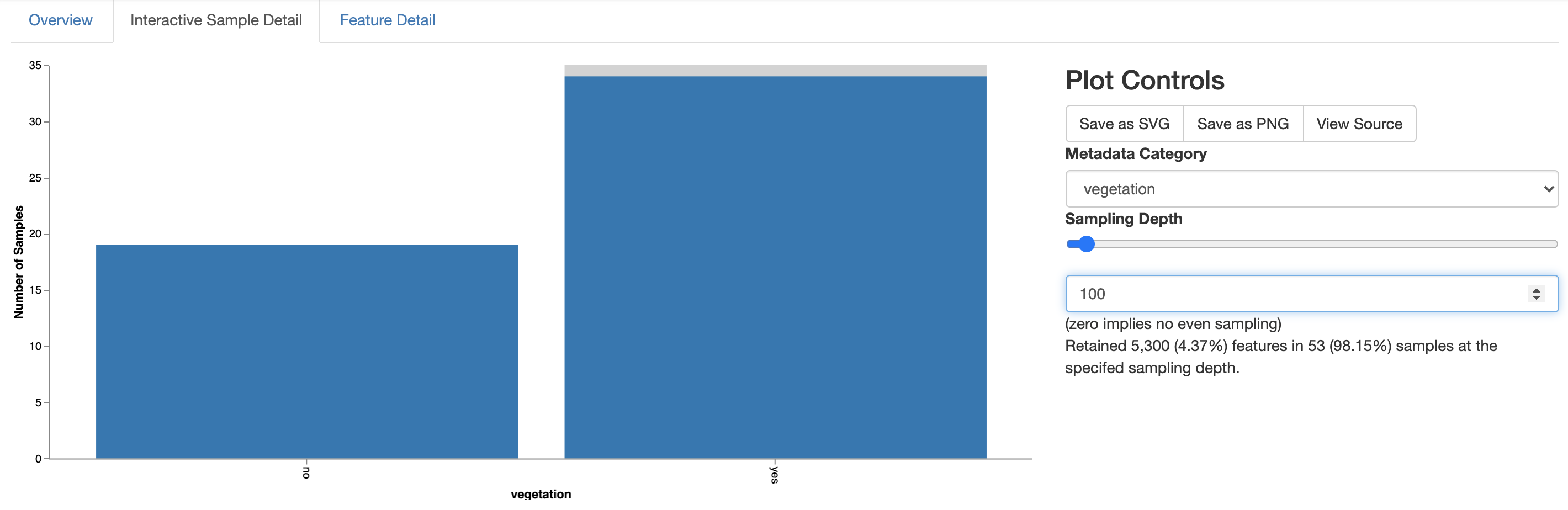
Fig. 3.7 Simplified screenshot of Interactive Sample Detail tab of asv-table.qzv.
The barplot on the left now tells you how many samples in each metadata group have at least 100 (or whatever value your slider landed on) sequences. In this case, all of the samples with less than 100 sequences came from sites with no vegetation. These sites are in the hyper-arid core of the desert, and I suspect the reason we obtained so few sequences for these samples is because the microbial biomass is so low that the microbes often fall below the limits of our detection with the Earth Microbiome Project protocol. Remember that this is a very extreme environment - it’s not very surprising to me that the 16S rRNA protocols that we use for the majority of sites on the Earth are challenged here. Importantly though, this hasn’t impacted all of the sites without vegetation so we can still compare these sites to the vegetated sites that are outside of the hyper-arid core of the desert. We’ll now begin to wrap this quick overview up with a comparison of the community richness at the vegetated versus not vegetated sites.
3.8. Computing community richness at different depths of sequencing
Next we’ll generate an alpha rarefaction plot which presents community richness as a function of the number of sequences obtained per sample.
Community richness can be computed with many different metrics. The alpha-rarefaction visualizer in the q2-diversity plugin defaults to compute Observed Features and the Shannon Diversity Index (the details of these and other diversity metrics will be introduced in later chapters - in both cases, higher values means more diverse communities). You can see these and other default settings for this visualizer by calling qiime diversity alpha-rarefaction --help.
It is important to compute community richness as a function of the number of sequences obtained per sample because in a microbiome survey this represents our sampling effort. An analogy is useful to illustrate this. Imagine a researcher is interested in comparing plant diversity in the Sonoran Desert (USA) and the Monte Verde Cloud Forest (Costa Rica). If they were to attempt to achieve this by counting plant species in a square meter in the forest and a square kilometer in the desert, they might come to the flawed conclusion that the desert had more types of plants than the forest. This would of course be because they expended more effort sampling plants in the desert than in the forest, so had more opportunity to observe different types of plants. In a sequencing survey, the number of sequences obtained per sample often doesn’t reflect biological features of the environments being studied, but rather random artifacts of the DNA extraction, PCR, and sequencing workflows. Differences in depth of sequencing therefore similarly represent sampling effort. (An exception to this is in extreme cases, such as the hyper-arid desert samples in this study where there are sometimes too few microbes to detect with standard workflows.) Differences in depth of sequencing need to be controlled for across samples to enable direct comparison. There are a variety of ways to do this that will be covered in later chapters. The simplest approach is referred to as rarefaction, and involves defining a sequencing depth and randomly sampling the counts in all samples without replacement to that depth. If a sample has fewer sequences than the defined depth of sequencing, that sample is excluded from the analysis at that depth of sequencing. In a rarefaction plot, multiple depths of sequencing are compared along the x-axis to illustrate change in richness on the y-axis. In the alpha-rarefaction visualizer, the minimum depth of sequencing used defaults to 1. When calling the command, the user specifies the maximum rarefaction depth. I usually choose a round number near the 3rd quartile frequency per sample from the feature table visual summary (Fig. 3.6). Run this command as follows:
qiime diversity alpha-rarefaction \
  --i-table asv-table.qza \
  --p-max-depth 2700 \
  --m-metadata-file sample-metadata.tsv \
  --o-visualization alpha-rarefaction.qzv
Saved Visualization to: alpha-rarefaction.qzv
Within the interactive visualization, samples can be grouped into metadata categories to facilitate visual comparisons. In the sample metadata column select vegetation to group samples based on whether they are observed in sites containing or not containing vegetation. You should see a view that looks something like Fig. 3.8.
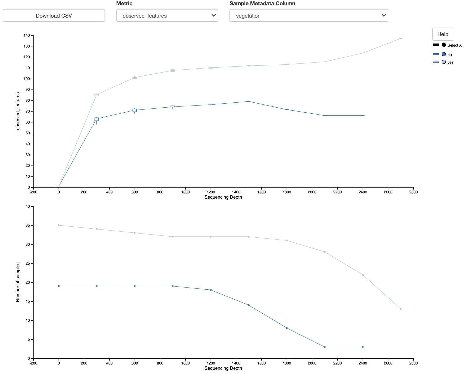
Fig. 3.8 Simplified screenshot of alpha-rarefaction.qzv.
Note that there are two plots here. The top plot shows the Observed Features metric as a function of Sequence Depth. This is the alpha rarefaction plot. The bottom plot is essential to interpreting the alpha rarefaction plot. This shows the number of samples in each group as a function of sequencing depth. Recall that at a given sequencing depth, if the sequence count is less than the specified sequencing depth the sample is excluded from analyses at that sequencing depth. The bottom plot illustrates that at higher sequencing depths we lose many of our samples. This may explain erratic behavior in the two plots at higher sequence depths (where the Observed Features starts to decrease for the unvegetated sites and starts to increase for the vegetated sites). The bottom plot thus suggests where we should focus our attention in the top plot.
When I compare the Observed Features across the unvegetated and vegetated sites at about 1000-4000 sequences per sample, I see that there appears to be a clear difference in the number of features observed, with the unvegetated sites having a lower community richness than the vegetated sites. This appears to support the hypothesis that was stated in the beginning of this chapter.
I can conclude this analysis by running a statistical test to compare these sites. One catch with a statistical test is that, due to current limitations in the available tests, this is typically performed at a single depth of sequencing. Based on the rarefaction plot, I will perform a statistical comparison of community richness across groups at a sequencing depth of 1200. This is because I have retained most of my samples at this stage, and because the difference in community richness appears stable in that region of the rarefaction plot.
Three commands are required to run this statistical test. Run these commands now.
The first rarefies the ASV table to contain exactly 1200 sequences per sample, and discards samples that had fewer than 1200 sequences.
qiime feature-table rarefy \
  --i-table asv-table.qza \
  --p-sampling-depth 1200 \
  --o-rarefied-table asv-table-1200.qza
Saved FeatureTable[Frequency] to: asv-table-1200.qza
The next command computes the Observed Features metric on all samples in the rarefied feature table.
qiime diversity alpha \
  --i-table asv-table-1200.qza \
  --p-metric observed_features \
  --o-alpha-diversity observed-features-1200.qza
Saved SampleData[AlphaDiversity] to: observed-features-1200.qza
The third command performs a Kruskal-Wallis test on the Observed Features values and generates a visual summary of the results.
qiime diversity alpha-group-significance \
  --i-alpha-diversity observed-features-1200.qza \
  --m-metadata-file sample-metadata.tsv \
  --o-visualization observed-features-1200.qzv
Saved Visualization to: observed-features-1200.qzv
As is always the case, you can call any of these commands with the --help option to learn more about what they do, what default values they use, and how you can change their behavior. Load observed-features-1200.qzv with QIIME 2 View.
In the resulting visualization, select vegetation in the Column dropdown box. This will present the Observed Features in the unvegetated versus vegetated sites with a pair of boxplots and a statistical test. Your view should look like Fig. 3.9.
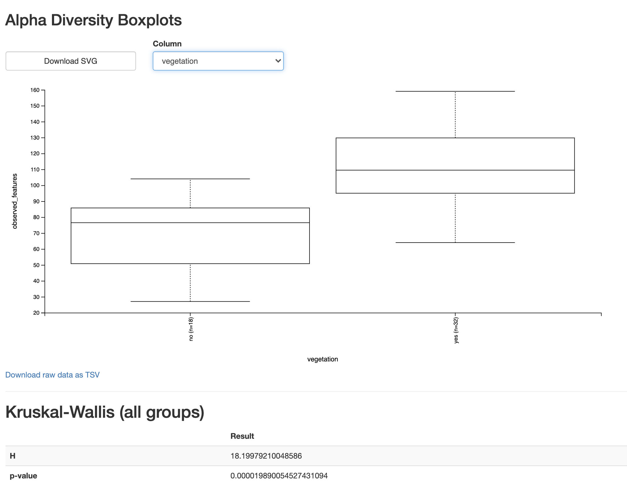
Fig. 3.9 Simplified screenshot of observed-features-1200.qzv.
This view confirms what we suspected from our visual comparison of these categories in the alpha rarefaction plot. Based on a Kruskal-Wallis test (a non-parametric test for comparing distributions of values) and the accompanying boxplot we can conclude that the unvegetated site have significantly fewer ASVs than the vegetated sites, supporting the hypothesis presented at the beginning of this chapter.
3.9. Wrapping up
I’ll conclude this initial QIIME 2 exercise here. In this chapter you downloaded sequencing data, performed quality filtering with QIIME 2, and generated several visual summaries of the data. This introduced you to the QIIME 2 command line interface. You performed both qualitative and quantitative assessments of the hypothesis presented in the beginning of the chapter, and learned to view those results using QIIME 2 View. A lot of ground was covered in this chapter! We’ll now begin to explore the steps in QIIME 2 workflows in more detail, and fill in some of the gaps that we left in this introductory chapter.
3.10. List of works cited
- CMR+16
Benjamin J Callahan, Paul J McMurdie, Michael J Rosen, Andrew W Han, Amy Jo A Johnson, and Susan P Holmes. DADA2: high-resolution sample inference from illumina amplicon data. Nat. Methods, May 2016.
- NCC+17
Julia W Neilson, Katy Califf, Cesar Cardona, Audrey Copeland, Will van Treuren, Karen L Josephson, Rob Knight, Jack A Gilbert, Jay Quade, J Gregory Caporaso, and Raina M Maier. Significant impacts of increasing aridity on the arid soil microbiome. mSystems, May 2017.